DC 311
A service design project aimed to better understand the needs of ward 7 residents in Washington, DC. Based on resident feedback the team determined usability improvements were needed to the DC 311 website, an advertising campaign informing residents of city services, and a 311 advocates program in partnership with Ward 8.
Improving digital services for DC residents
ROLES
User research and discovery
Lo-fidelity prototyping
User testing
Awareness
What are people saying?
What assumptions do we have?
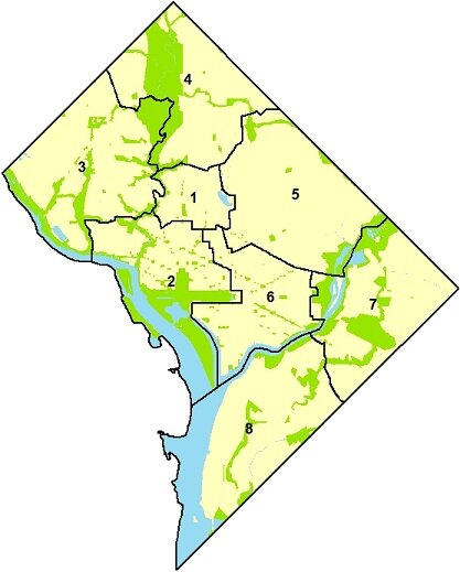
In order to get a high level overview of DC resident sentiments, we sent out a screener survey and got responses from 197 people. Our responses came from all eight wards and helped us understand the most pressing needs across the city.
Ward 1-6 residents’ issues revolved around improving city infrastructure and services like trash cleanup. Wards 7 and 8 east of the Anacostia river had more dire concerns.
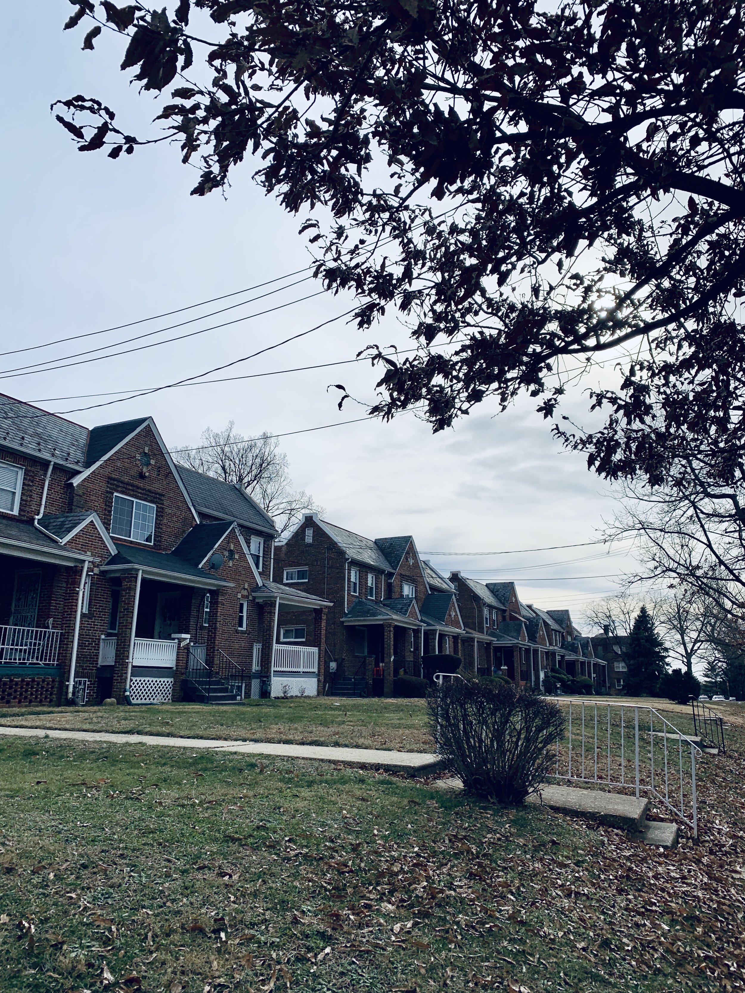
Concerns of ward 7 residents
“Forced displacement of people of color”
“Lack of opportunities for the poorly educated”
“Politics and privilege on the other (mostly white) side of the city”
“People in power fostering discrimination through gentrification efforts”
Observation
What data do we need to collect?
How well do current solutions work?
What are people doing today?
We used survey responses to frame our in-person interview questions. Issues with city services was a common topic, leading us to ask residents about DC 311 and other non-emergency services.
In order to get a clear picture of the state of services in our assigned ward, we interviewed 7 residents at two public libraries in ward 7. We also conducted nine other interviews with people from other DC wards. While ward 7 needs were the focus of this project, the final design and recommendations had to apply to all of DC so it was important to have that context as well.
Francis A. Gregory Library in ward 7
Interpretation
How might we interpret our findings?
What are the pain points and opportunities?
From our 16 in-person interviews, we affinity mapped the responses into two main groups: urgent resident needs and methods of accessing DC government as a resident.
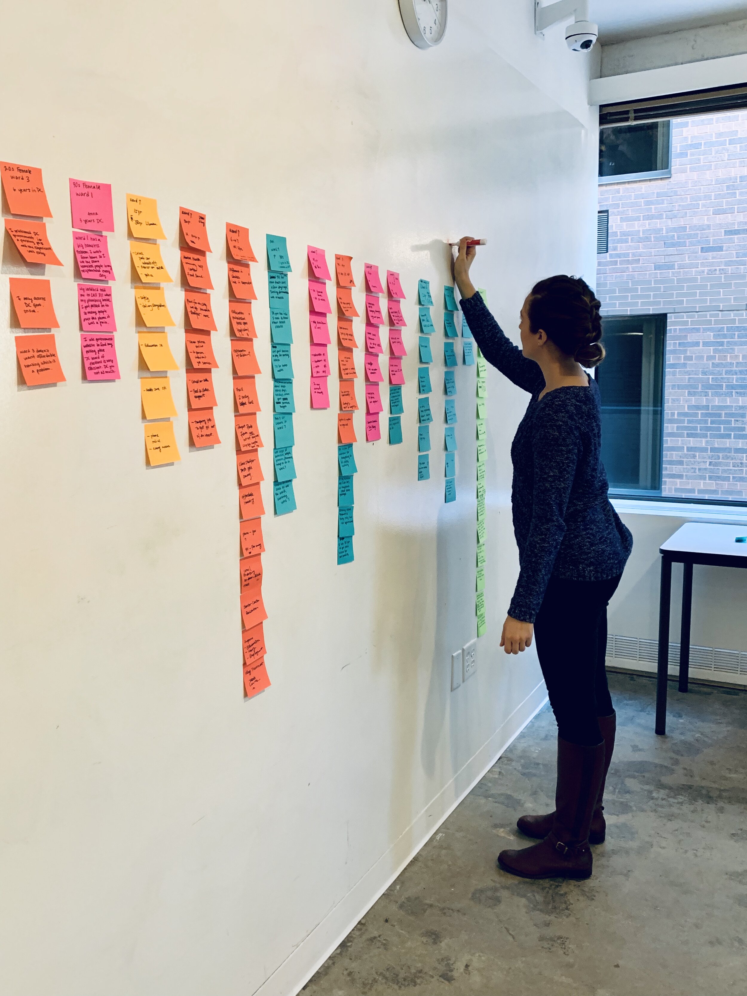
Each column of notes represents a single subject and their responses.
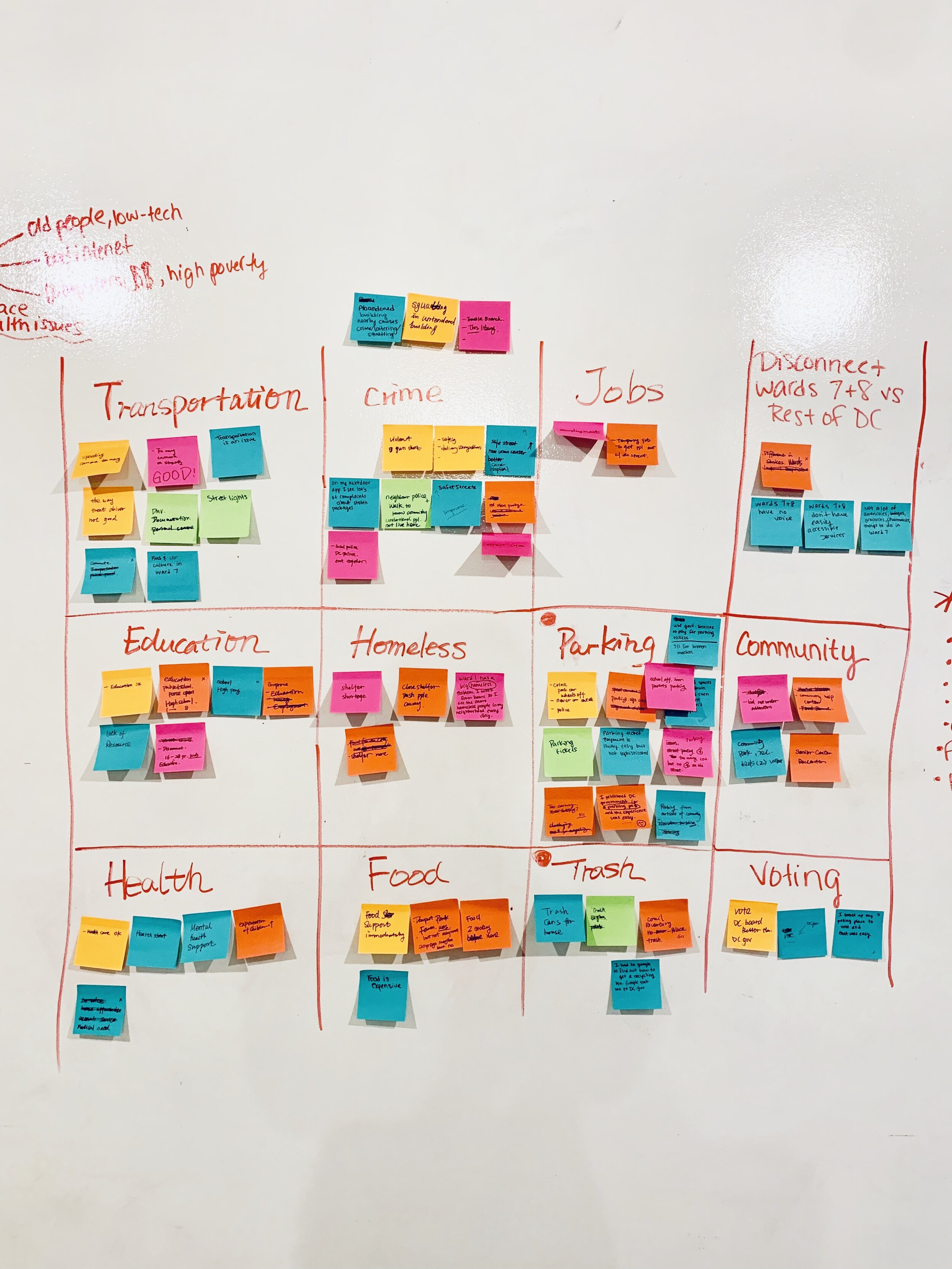
Identifying the most urgent needs across the city and grouping them by theme.
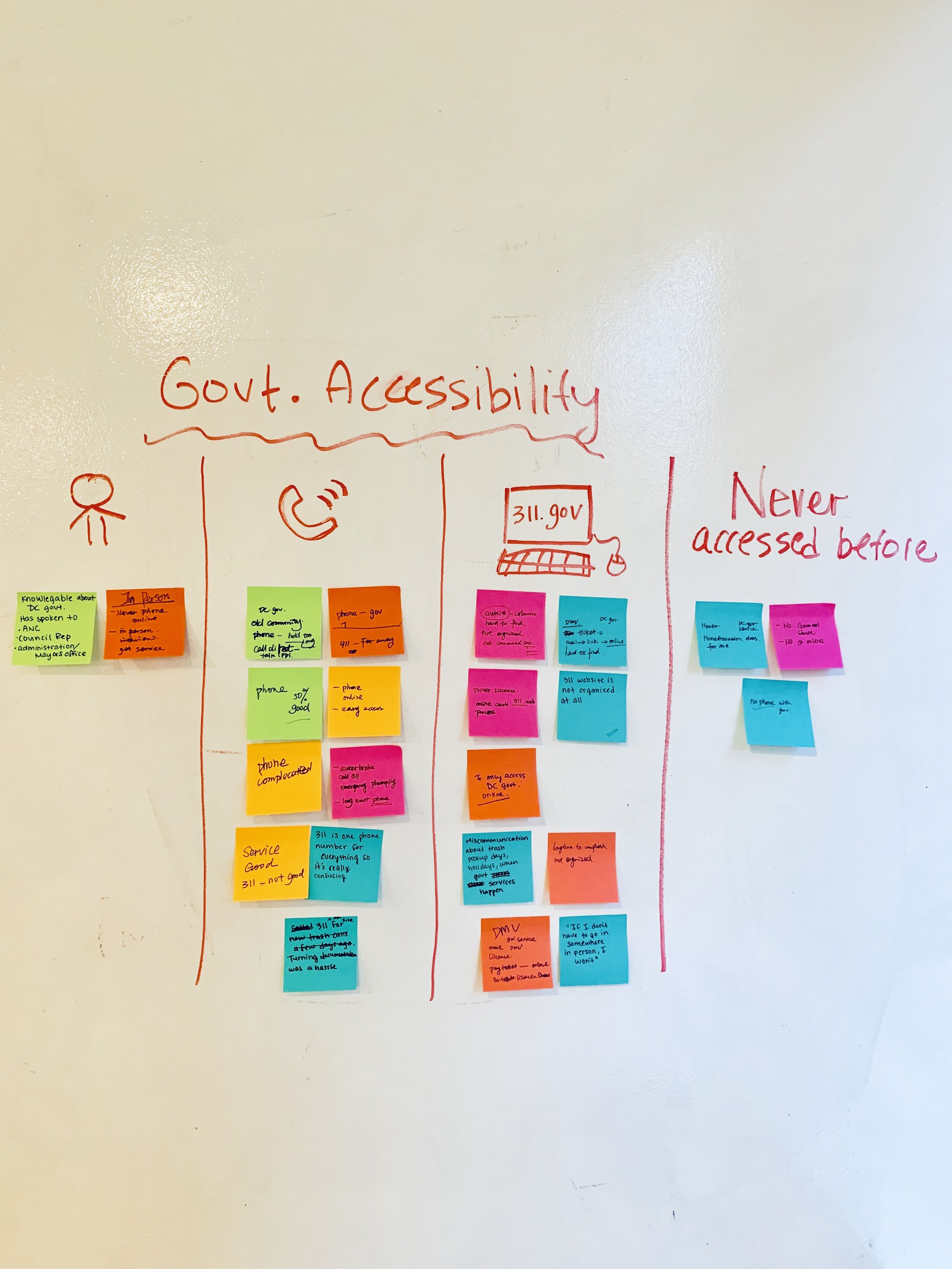
How residents access DC government services based on interview responses.
Creating personas
Based on our affinity mapping, we developed three DC personas. Two of them were based on our Ward 7 interviews, and one represented a resident of Ward 4.
We decided to focus on James, who lives in Ward 7 and works at Benning library as a library assistant. James works on the front lines of homelessness, people having mental health crises, under supervised children, and public safety issues daily at his job.
In order to develop improvements for James we took note of his current problems with DC Government services:
He thinks 311 is not reliable because the phone operators do not transfer him to the right place.
He finds the 311 website confusing and does not like the experience.
He feels that Ward 7 is not getting the attention it needs and is generally skeptical of the city government.
Recommending improvements
From our user research, we were able to develop key recommendations for DC government.
Execute an ad campaign for 311 across wards to raise awareness and inform residents the ways that local government can help.
Equip community workers, like James, with knowledge around government services through a 311 advocates program. We collaborated with colleagues focusing on Ward 8 and they made this program their main recommendation for DC government.
Redesign the 311 homepage to better reflect the service needs of residents.
Exploration
How might we consider the whole experience?
What ideas or hypotheses do we want to test?
We tasked five people with navigating the current 311 site. Our users could accomplish the task we gave them, but there were pain points along the way and it generally was not a positive experience.
Documenting the user journey
From our usability testing of the DC 311 website, we developed a journey map that documented users’ feelings while using this product. This map allowed us to visually document each pain point and track users’ emotional states during test sessions. The dips in the line graph represent frustrations while the peaks were positive feelings and satisfaction.
When we began designing an improved DC 311 homepage, we returned to James’ main issue with the 311 website - he finds it confusing and does not like the experience. In an ideal 311 redesign, his path accessing the service would have fewer delays without the pain points we identified in the journey map.
A design studio exercise helped us develop the initial wireframe for the website homepage.
Our final concept from this exercise included features from other city 311 sites along with the services DC residents found most urgent.
Validation
Did we confirm or refute our assumption?
How do we know if we are on the right track?
Next, we built a paper prototype with hotspots to be used in another round of testing. We decided a card sorting exercise would help us discover what users found intuitive when navigating 311 services.
We tasked five people to arrange service category cards on the carousel according to their preference. What we hoped to gain from this exercise was an intuitive order of services on the homepage.
We found that the most actionable and urgent services like public city, parking, and transportation were put in front. Less action oriented and informative 311 services were placed last.
User completing a test on the 311 paper prototype
New 311 homepage
Due to the constraint of a 2 week project timeline, we limited our prototype to a redesigned mobile and desktop homepage. This landing page incorporates our discoveries from user research and testing. It is not too long and provides clearer navigation than before.
For next steps we recommended conducting a soft launch rather than bombarding DC residents at once with a new website. From here we could collect metrics, launch a 311 marketing campaign throughout the city, and continue to iterate upon what we started.
What I learned from this project
For next steps, we suggested redesigning the full 311 website. We also recommended a “soft launch” rather than bombarding DC residents at once with a new website. For example, New York’s 311 page has a banner on their current site to have users opt-in to their new content.
This project revealed the need to understand, research and engage with DC residents from all wards in order to provide the best government services possible. We were able to shine a spotlight on ward 7, whose needs are often overlooked compared to other parts of the city.

